Logos, Good & Bad
Good:
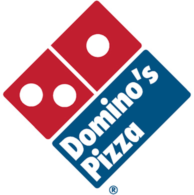 The Domino’s Pizza logo is a good example of logo design because the visual incorporates both the name of the company, and what they do. Half of the logo is designed to look like dominoes, while the other half adds to the overall design to make it look like a pizza box. If the text with the name were to be taken away from the logo, viewers would still be able to understand what company the logo is for.
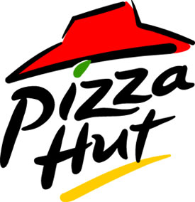 Very similar to the Domino’s Pizza logo, the Pizza Hut logo visually represents the name of the company, through the red “roof” implying a hut. Though the name of the company is included in the logo, it adds to the logo, as the type is a slanted, handwritten style, implying that the pizza is both handmade and will be delivered fast.
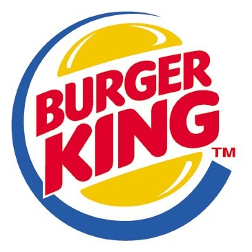 Similar to the Pizza Hut and Domino’s logo the Burger King logo illustrates both the name of the company as well as the product it sells: the burger. By using bright, primary colors the logo remains easy to distinguish from others.
 Harney & Son’s is a completely different kind of company to the previous ones mentioned. It is a company that creates semi “luxury” products, teas that are supposed to be fine, unique, and exclusive. The fine lines and the ornate design of the logo surrounding the name reflects this luxury attitude of the products Harney & Son’s creates, linking it to an older era of aristocracy.
 Max Brenner uses a visualization of the creator of the company in a simplified manner, but also in a style that reflects chic simplicity done in melted chocolate. Thus, this logo takes into account the name of the company, what the company does, as well as the chic, modern style of the restaurant. This logo could be understood even if the text were to be taken away.
Bad:
 The Bennigan’s logo does not illustrate what Bennigan’s is, what products they sell, or really anything much more than that it is an “old fashioned” restaurant. The text of the name is the only thing we are given, without the name, there would be no logo. We are only given a tiny detail of design underlining the text, however it is unclear what this is supposed to be.
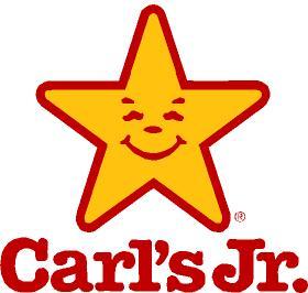 The Carl’s Jr has an extremely poor logo design, as it is almost exactly like the Hardees logo. Because it does not differentiate the company form its competition it does not successfully carry out the job of a logo.
 The Denny’s logo doesn’t illustrate anything about the company. The shape is also so simplified that if the text were to be taken away no one would be able to tell what the logo is for.
 The Taco Time logo is another example of a logo that doesn’t differentiate the product enough from its competition. Many other mexican fast food chains, like Qdoba also use the cactus in their logo, and the same colors. The text is also not in a font that adds anything to the meaning of the logo.
 Though the Popeyes logo does use text in a way so it adds to the overall meaning of the logo, there is no simplified design visual that illustrates what product the company sells. It relies solely on text, without the text the logo would collapse and no meaning would be transferred to the user.